
Responsive Padding: How to Make Your Flutter UI Feel Less Boxy
One of the most common layout “smells” in Flutter apps is padding that feels too tight on mobile or too sparse on larger screens.
Introduction
Even beautiful UIs can feel a little… boxy.
Sometimes it’s not the color scheme or typography, it’s the spacing.
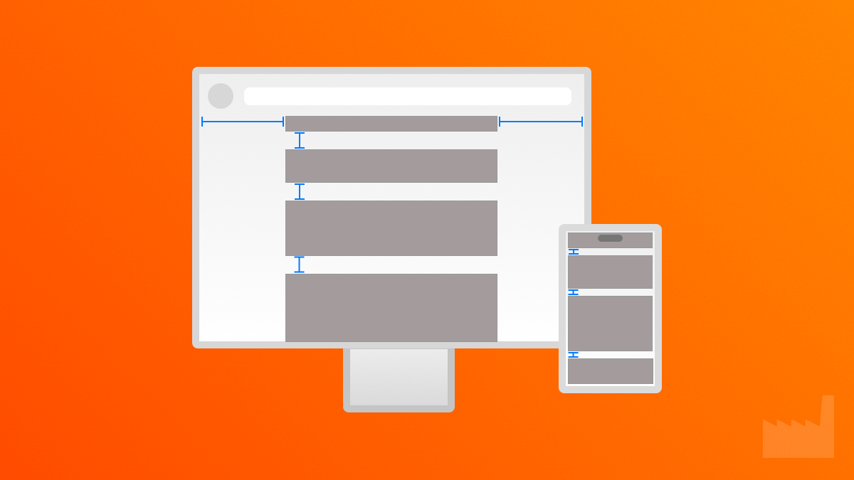
One of the most common layout “smells” in Flutter apps is padding that feels too tight on mobile or too sparse on larger screens. We hardcode values like EdgeInsets.all(16) without thinking twice, but that same spacing can feel wildly different depending on the platform or screen size.
In this article, I’ll walk through a small but powerful utility function that adds platform-aware padding to your widgets. It’s simple, responsive, and makes your UI feel instantly more polished, without needing a full design system or layout engine.
What’s the Problem?
- Hardcoded padding doesn’t scale across devices.
- Mobile needs tighter layout to save space.
- Web and desktop need breathing room , especially for center-column layouts.
- Many apps use the same padding everywhere, which creates a cramped feel on mobile and excessive whitespace on desktop.
The Goal
Create a utility function like:
EdgeInsets platformAwarePadding(BuildContext context);That returns tighter padding for mobile and roomier spacing for web and desktop, ideally with just one line of code.
The Code
Here’s the full one-file example you can copy into your project today.
import 'package:flutter/foundation.dart';
import 'package:flutter/material.dart';

/// Returns tighter padding for mobile, roomier padding for web and desktop.
EdgeInsets platformAwarePadding(BuildContext context) {
  return platformAwarePaddingFor(
    isWeb: kIsWeb,
    platform: defaultTargetPlatform,
  );
}

EdgeInsets platformAwarePaddingFor({
  required bool isWeb,
  required TargetPlatform platform,
}) {
  // You can tweak these values as needed.
  const mobilePadding = EdgeInsets.symmetric(horizontal: 16.0, vertical: 12.0);
  const desktopPadding = EdgeInsets.symmetric(horizontal: 32.0, vertical: 24.0);

  // Web and desktop get extra breathing room
  if (isWeb || {
    TargetPlatform.macOS,
    TargetPlatform.windows,
    TargetPlatform.linux,
  }.contains(platform)) {
    return desktopPadding;
  }

  // Default to mobile
  return mobilePadding;
}

/// Example usage in a widget
class PaddingDemo extends StatelessWidget {
  const PaddingDemo({super.key});

  @override
  Widget build(BuildContext context) {
    return Scaffold(
      appBar: AppBar(title: const Text('Platform-Aware Padding')),
      body: Padding(
        padding: platformAwarePadding(context),
        child: const Column(
          crossAxisAlignment: CrossAxisAlignment.start,
          children: [
            Text(
              'This layout adapts its padding based on the platform.',
              style: TextStyle(fontSize: 18),
            ),
            SizedBox(height: 12),
            Text('Try running it on mobile vs web/desktop.'),
          ],
        ),
      ),
    );
  }
}
What This Code Does:
- Uses
kIsWebanddefaultTargetPlatformto determine the runtime environment. - Provides sensible default padding for mobile vs non-mobile platforms.
- Keeps it readable and easily extensible (you could add screen-width logic later).
Real-World Use
Wrap common layout widgets like Padding, Container, Card, or Scaffold with your utility:
Padding(
  padding: platformAwarePadding(context),
  child: Column(
    children: [/* ... */],
  ),
)
You can also extend this idea for platformAwareMargin, platformAwareSpacing, or platformAwareTextScale.
Testing It
To ensure the padding logic behaves consistently across platforms, we’ve added unit tests using flutter_test. These tests directly invoke platformAwarePaddingFor, passing in different combinations of isWeb and TargetPlatform values. By asserting the expected EdgeInsets in each case, we can verify that the padding adapts correctly for mobile, desktop, and web environments without relying on actual device conditions. This makes it easy to maintain and evolve the logic over time.
import 'package:flutter/material.dart';
import 'package:flutter_test/flutter_test.dart';

void main() {
  group('platformAwarePaddingFor', () {
    test('returns desktop padding for web', () {
      final padding = platformAwarePaddingFor(
        isWeb: true,
        platform: TargetPlatform.android,
      );
      expect(padding, const EdgeInsets.symmetric(horizontal: 32.0, vertical: 24.0));
    });

    test('returns desktop padding for macOS', () {
      final padding = platformAwarePaddingFor(
        isWeb: false,
        platform: TargetPlatform.macOS,
      );
      expect(padding, const EdgeInsets.symmetric(horizontal: 32.0, vertical: 24.0));
    });

    test('returns mobile padding for Android', () {
      final padding = platformAwarePaddingFor(
        isWeb: false,
        platform: TargetPlatform.android,
      );
      expect(padding, const EdgeInsets.symmetric(horizontal: 16.0, vertical: 12.0));
    });

    test('returns mobile padding for iOS', () {
      final padding = platformAwarePaddingFor(
        isWeb: false,
        platform: TargetPlatform.iOS,
      );
      expect(padding, const EdgeInsets.symmetric(horizontal: 16.0, vertical: 12.0));
    });
  });
}
Customize It
Want to base it on screen width instead of platform? Add logic like:
final width = MediaQuery.of(context).size.width;

if (width < 600) return EdgeInsets.all(12);
if (width < 1024) return EdgeInsets.all(20);
return EdgeInsets.all(32);
Now you’ve got fluid spacing instead of just platform-based.
Why This Matters
Good spacing makes UIs feel intentional.
It’s one of the easiest ways to give your app that “designed” look without overhauling anything.
This tiny utility works because it solves a small, annoying problem, and scales with you as your layout grows.
Key Takeaways
- Fixed padding doesn’t work well across platforms.
- Responsive spacing feels more natural.
- You can fix this with one function.
- It’s a low-effort, high-impact upgrade for any Flutter app.
Get the Code
You can explore, run, and modify the example project by cloning the repository:
git clone https://github.com/dartfoundry/flutter_platform_paddingOr visit the DartFoundry GitHub repo.